


The album art for the Los Angeles Electric 8's new release took a lot of love from the community. The circular element is a visualization of the entire album's contents. Treated as one track, the sound data was analyzed using a fast fourier transform in OpenFrameworks and stored as white space separated ASCII floats. This spectrum data was then plotted along a spiral, with color changes indicating the different pieces. The spiral was then repeated as part of the collaborative silk screening process. The typographic layouts were designed by Rebecca Shostak, using the typeface "Arual" by Curtis Mack. We used 5 Print Gocco screens in 2 days. The printing was done at Wild Magnolia Design in Culver City, then assembled at Pony House in San Pedro. I love the convenience of the gocco, but I'm interested in somehow replacing those yellow bulbs with something less wasteful, like possibly augmenting a camera's flash component to produce the same UV wavelength. If anyone out there knows more of the scientific details of the Gocco bulb, I'd be happy to do the circuit bending. It's beautiful to see a generated visualization printed in metallic gold and white ink. I hope more of my art projects in the future can be this collaborative.
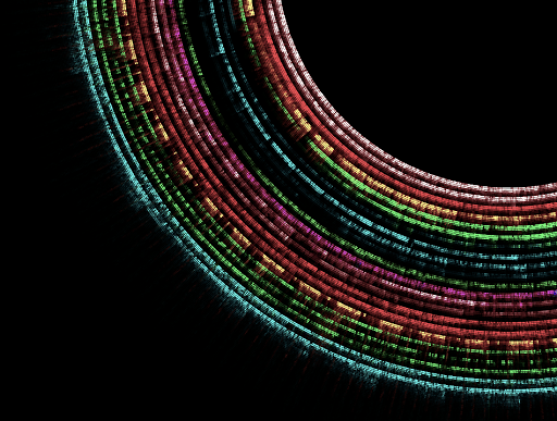
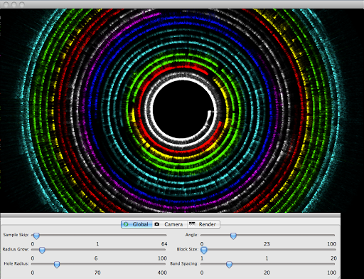
OpenFrameworks screenshot


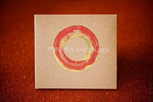
metallic gold, brick, and a bit of mossy green
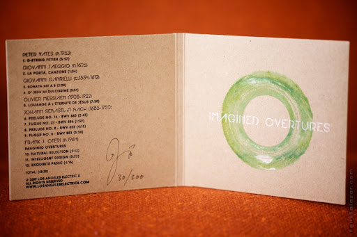
albums signed and numbered by artist
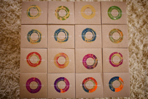
re-inking allowed much chromatic variation
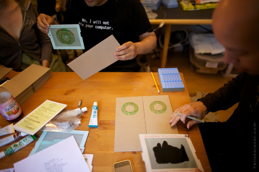
Becca, Josh, and Phillip
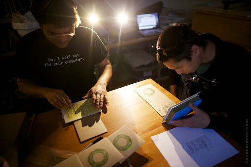
Josh and Marc
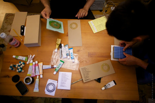
Josh and Marc
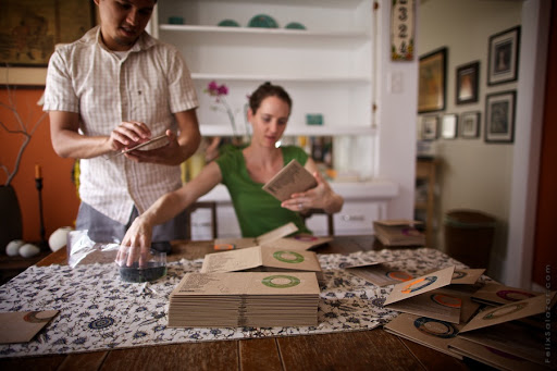
Assembled by Marc and Becky Nimoy

Felix Salazar